Evoserv
Evoserv is a facility management startup that needed their first proper identity. They'd been operating with a basic logo and were ready to look like an actual business when pitching to clients. The brief was straightforward: professional, modern, and needed to communicate that they're organised and capable without looking boring or corporate.
The Challenge
Facility management isn't exactly an exciting industry to design for. Most companies in the space either go full corporate or try too hard to look innovative with generic tech startup aesthetics. Evoserv needed to land somewhere in between: credible enough to win contracts, modern enough to not feel outdated.
The tricky part was finding a visual concept that actually meant something. Facilities management is about systems working together, maintenance, connectivity, but those are abstract ideas. I needed a mark that could represent that without resorting to clichés like gears or puzzle pieces.
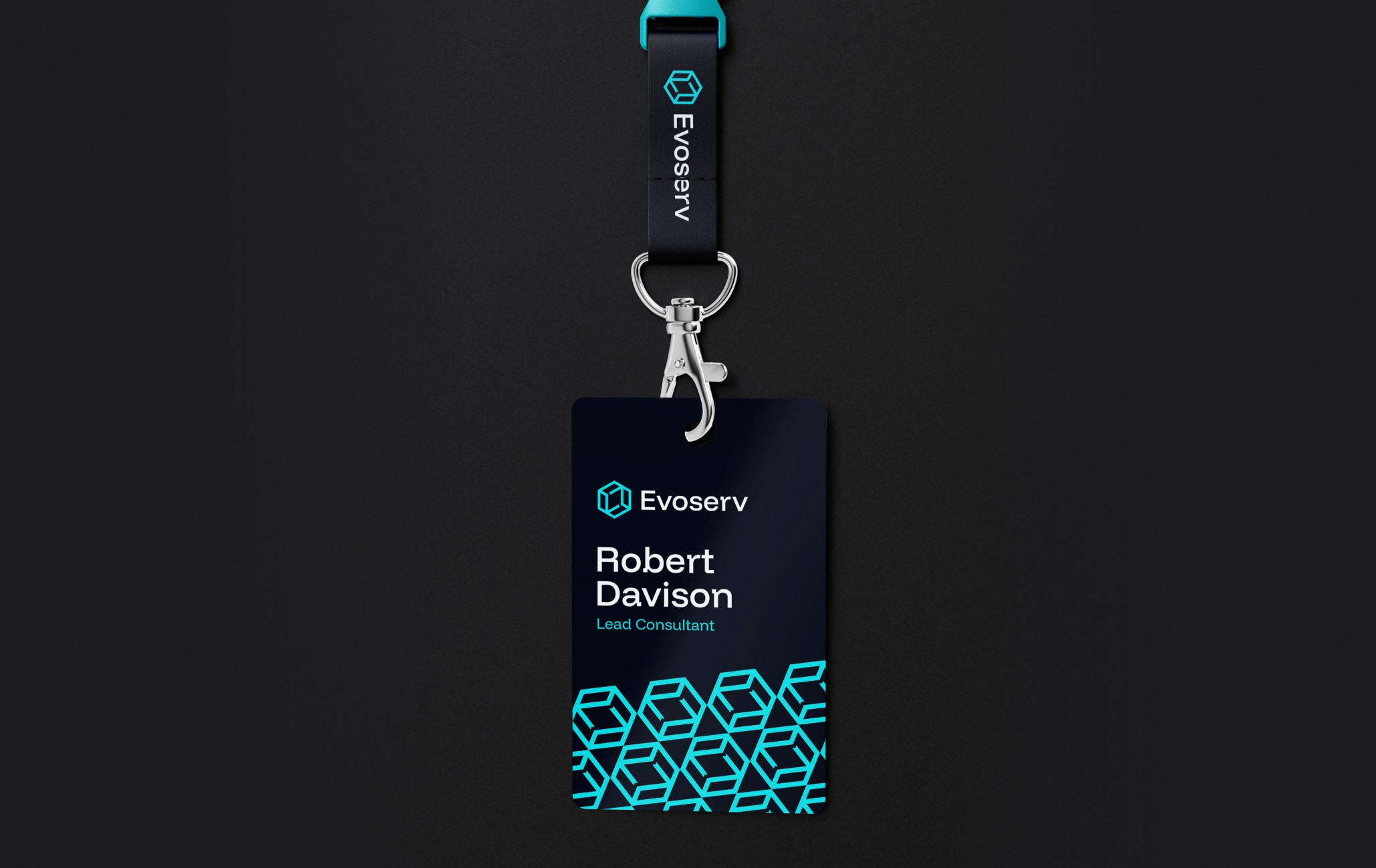
The Solution
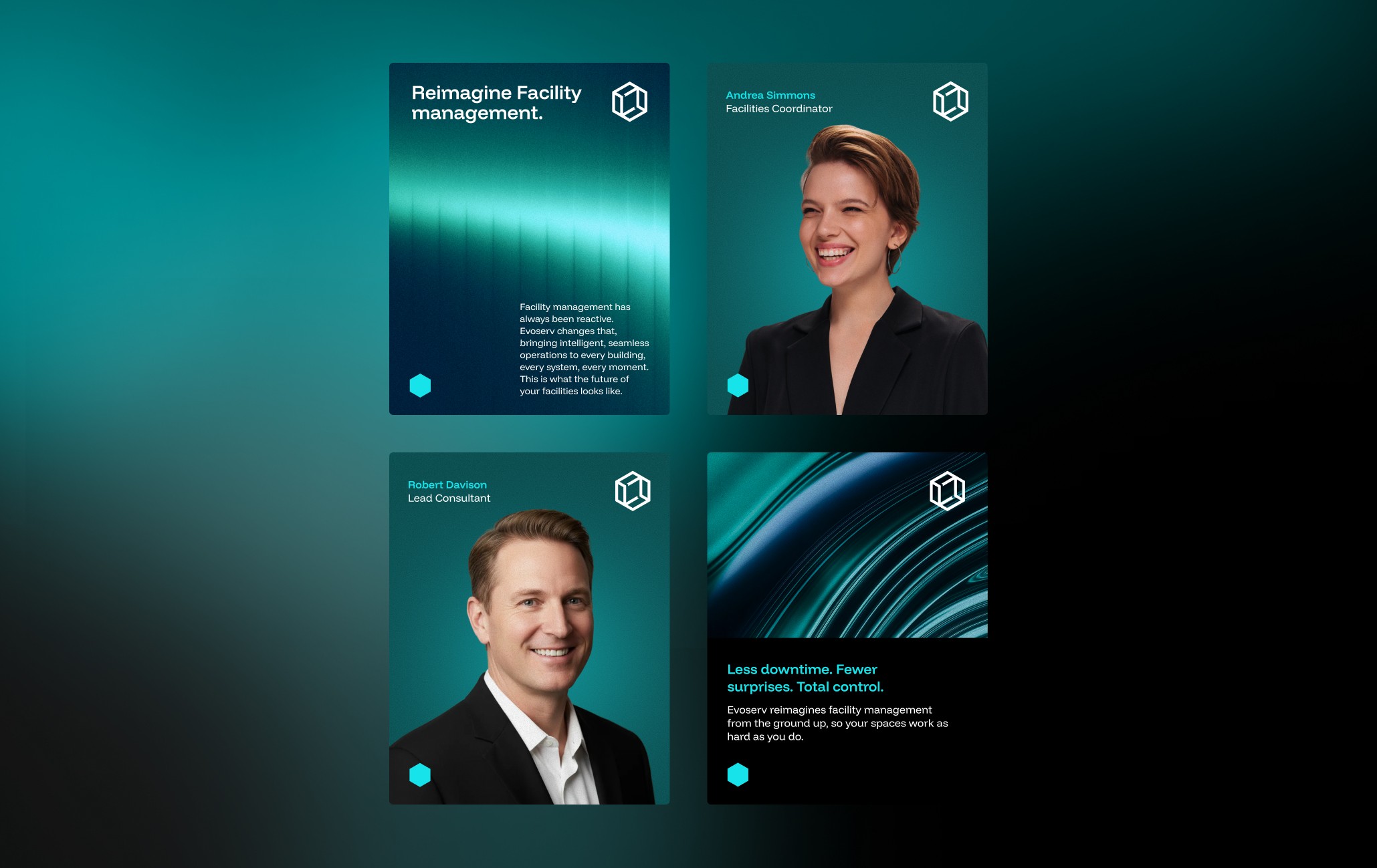
The logo uses overlapping hexagons in a wireframe style to create an interlocking structure. I started with one hexagon, overlaid four more at different angles to show how systems connect, which creates a sense of geometric depth. The wireframe approach keeps it from feeling too heavy or solid while still communicating structure and connectivity. Hexagons work well here because they naturally fit together, which mirrors how facility management is about multiple systems working in sync.
For the typeface I went with Funnel Display, a modern sans-serif with slightly shifted stems that give it a sense of forward movement without being overly stylised. It's bold and clean, which keeps the brand feeling confident and direct. The teal and off-black palette keeps it professional but avoids the generic corporate blue that every facilities company seems to default to.
The Result
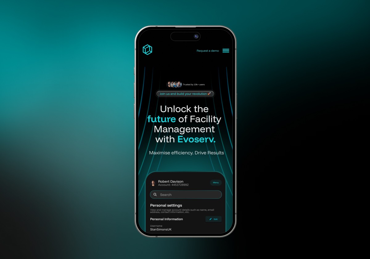
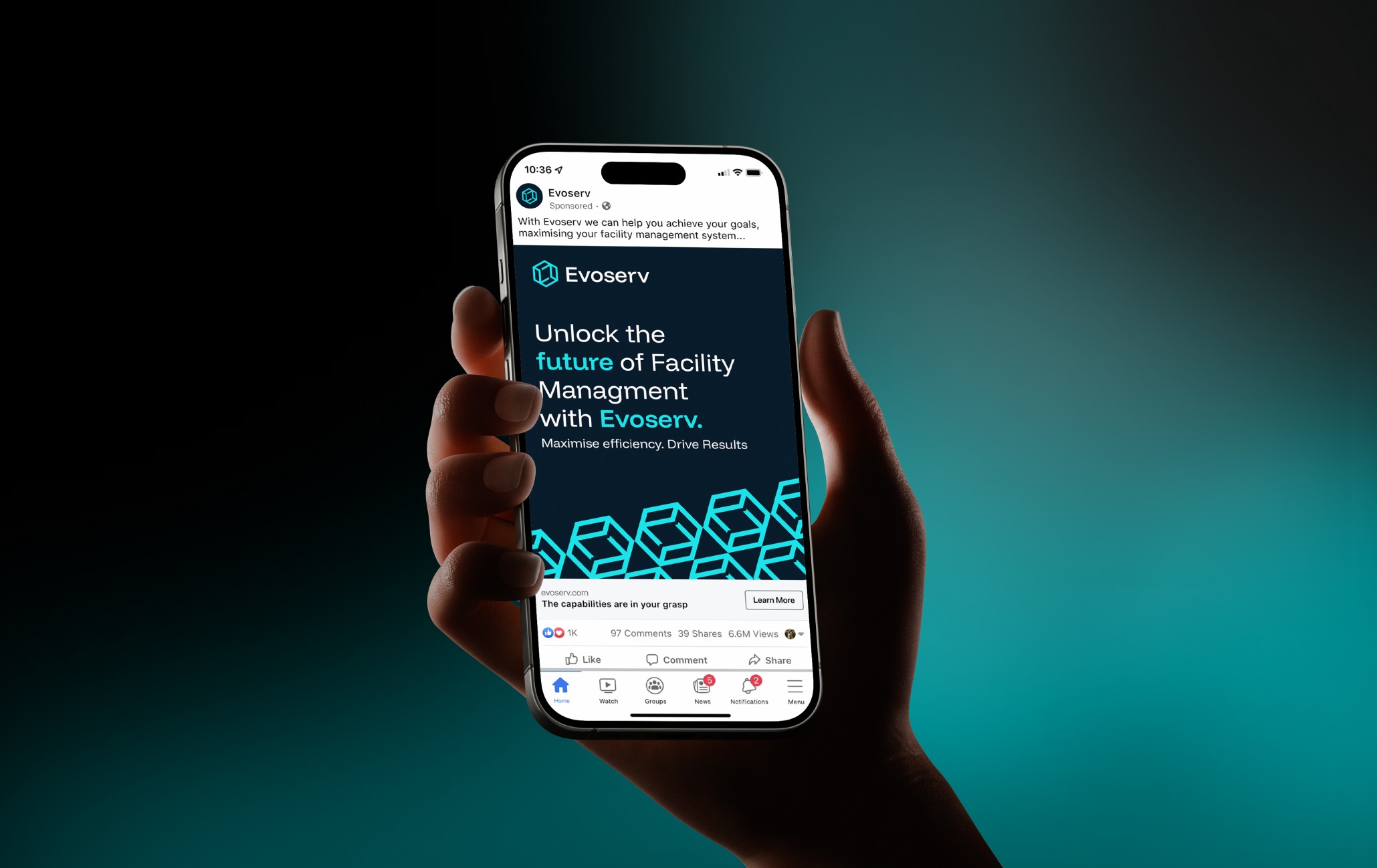
Evoserv now has an identity that looks put together and intentional. The monogram works at small sizes on uniforms and signage and scales up for digital use without losing clarity. It solves the credibility problem they had with their previous branding and gives them something that can grow with the business as they scale.