Yumy
Yumy already had a name and a product worth shouting about. What they needed was a brand that could hold its own on a shelf, turn heads at a food market, and speak directly to their audience. The brief was to create something bold and playful for a functional chocolate bar aimed at women who want the benefits of adaptogenic mushrooms like lion's mane, ashwagandha, and cordyceps, without it feeling like a health supplement.
The Challenge
The adaptogenic market is growing fast and most brands in the space lean heavily into the wellness aesthetic, earthy tones, clean sans-serifs, lots of white space. It looks considered but it all starts to blur together. Yumy wanted the opposite. A chocolate bar that feels fun, a little cheeky, and stands out for the right reasons whether it's sitting on a shelf next to competitors or being handed out at a food market.
The Solution
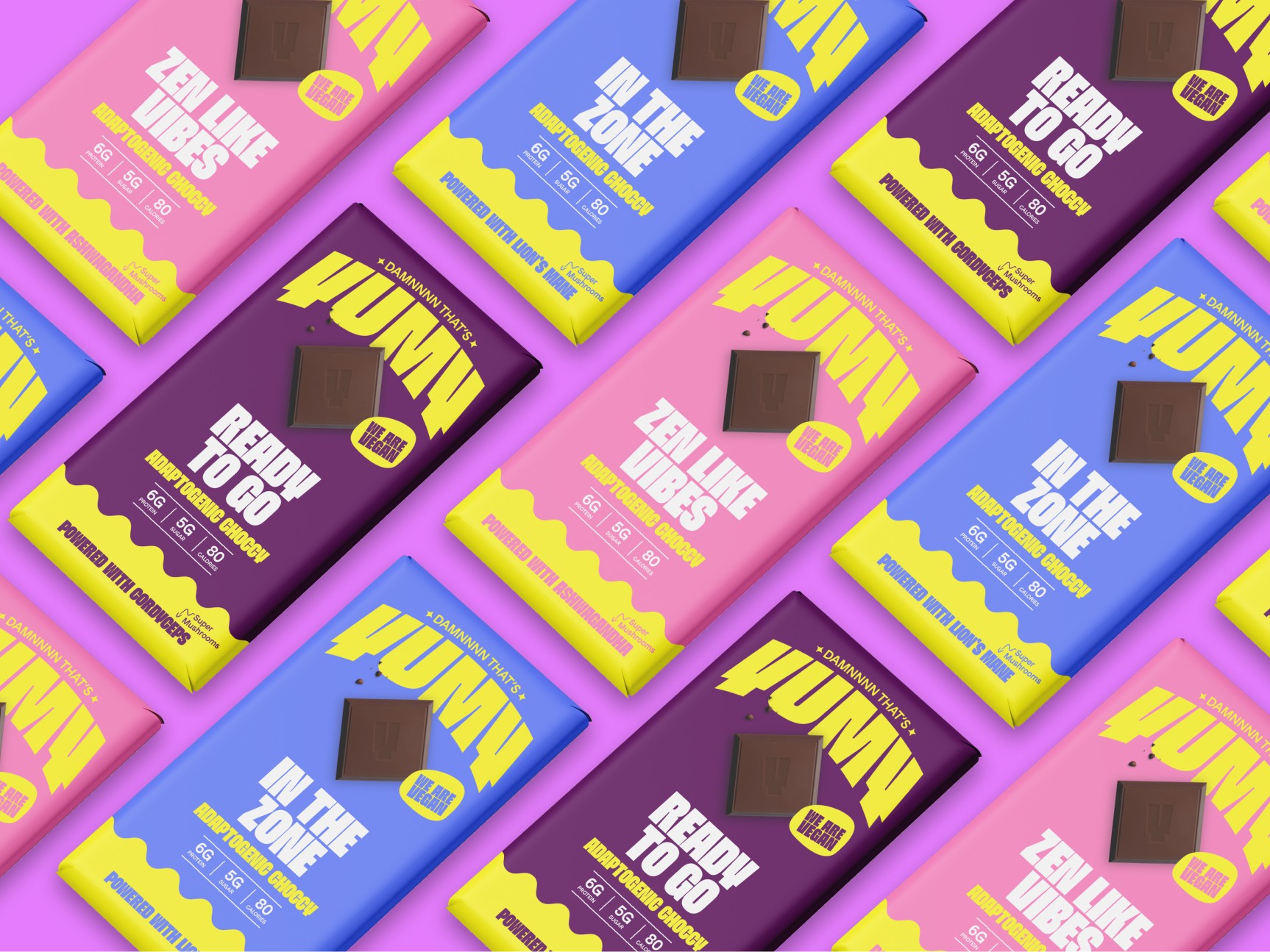
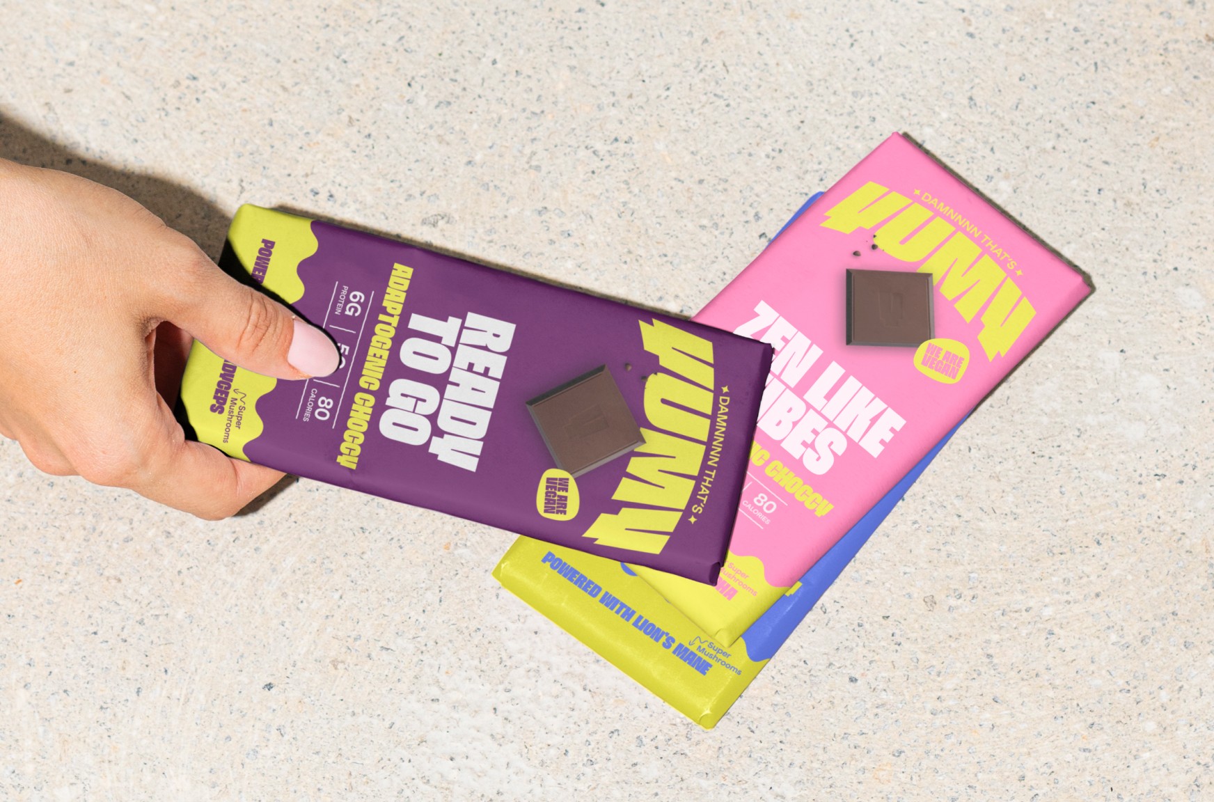
I took an existing typeface for the Yumy logo and reworked it so the letterforms curved, giving it a softer, more playful feel. Above the main logo sits the subline "Damnnnn That's" which sets the tone immediately. It's confident, a little tongue in cheek, and it tells you exactly what kind of brand this is before you've even read the product name.
The packaging uses a palette of bright, saturated colours including yellow, deep purple, pink, and blue that are bold individually but still feel cohesive as a range. The goal was that a customer could pick up any variant and instantly recognise it as Yumy without them all looking identical.
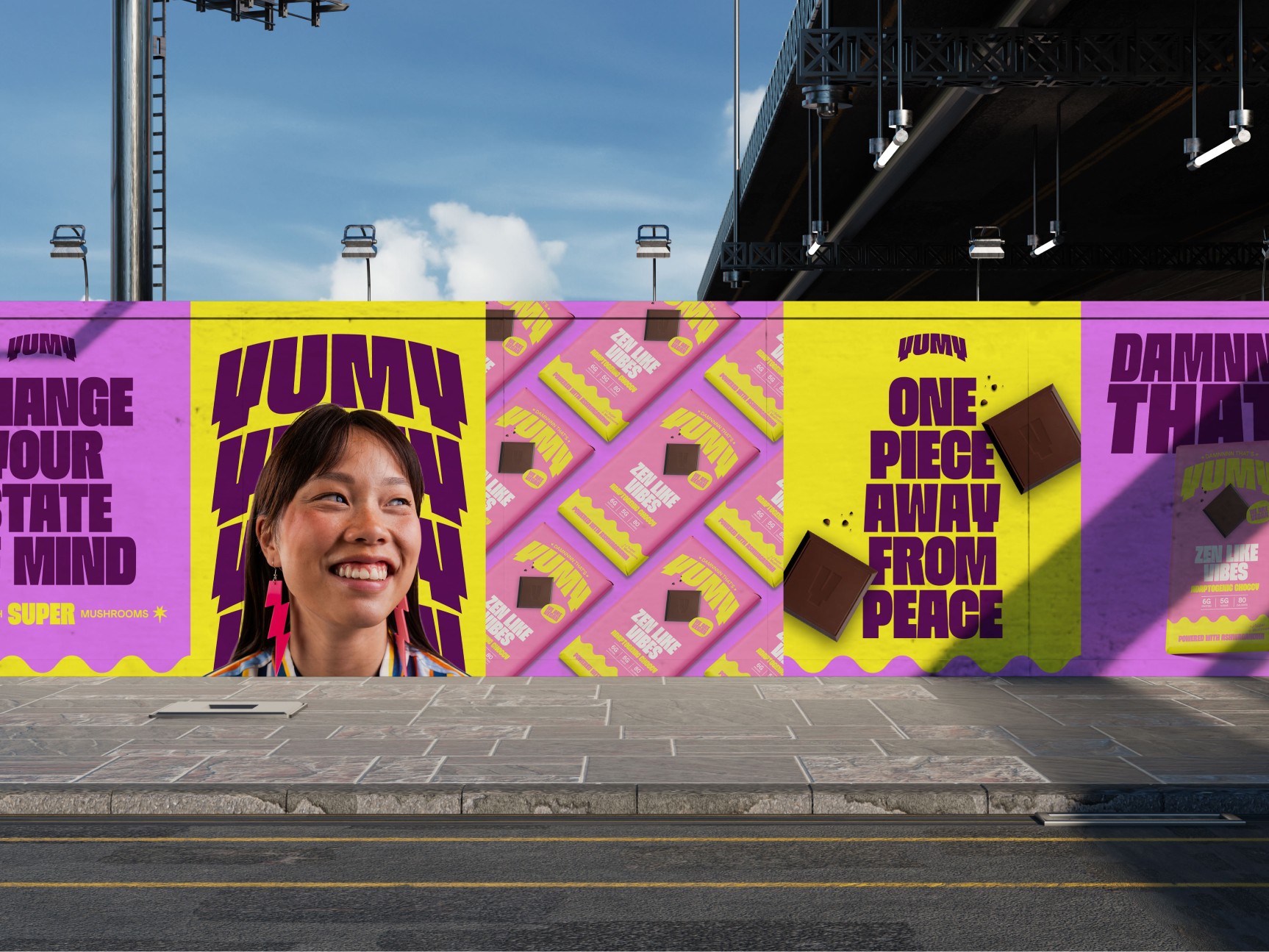
The social media assets carried the same energy, with copy that played on the product in a way that was clever without trying too hard. Lines like "Chocolate reimagined for the mind," "Shrooms that don't get you high," and "Mane Character" did a lot of the heavy lifting in terms of brand personality and made the product feel approachable and fun rather than worthy or medicinal.
The Result
Yumy ended up with a brand that genuinely reflects what the product is about. It's playful, it's distinct, and it doesn't look like anything else in the adaptogenic space. The kind of packaging that makes someone pick it up in a market just to have a closer look, which is exactly where you want to be.